One of the ways to make a harmonious look at home is through monochromatic color schemes. When it comes to decorating, these are also the commonly misunderstood term. However, if you know the basics of using a monochromatic color as well as the secrets to using it properly, you can easily create beautiful rooms.
Monochromatic Color Scheme – What is It?
In interior design, a monochromatic color scheme uses a single base color for the room, yet it incorporates shades, tones, and tints of the primary hue within the palette of the room. This makes a dramatic and bold look while being quite elegant and soft to the eye. It is easy to make a sense of balance and harmony in the room when you are using monochromatic color palettes in interior design.
Monochromatic doesn’t mean a single color in one value in the room. While monochromatic means one color, it means that the color is refined in several ways to make a livable space. Neutral color schemes may also be monochromatic with neutral color variations.
Why Monochromatic Color Schemes Make Decorating Simple?
If monochromatic schemes rely on a single color, how can you keep it from overwhelming the room? Well, you can do it through selecting a single color and using shades, tints, and tons of your chosen color. With the use of variations of a single color, it will make your room look bigger. This is the reason why monochromatic color schemes are best for decorating small spaces.
Once you differ your colors through using tints, shades, and tones, you are keeping your new color scheme from being monotonous. You will see how monochromatic color schemes can be monotonous without the variation of tints, tones, and shades.
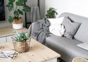
Patterns and Textures Are the Key to Perfect Monochromatic Color Schemes
The most enjoyable and attractive way of completing your color schemes is with print and texture. Texture basically adds interest to the room through uneven surface, which differs how light hits the surface. Texture may appear dark and light even when made with the same color. Window treatments, throw pillows, and rugs are the beautiful ways to make texture.
With the use of monochromatic prints, it may add visual interest without sacrificing the monochromatic look. Since neutral colors may be added as accents to non-neutral schemes, fabric patterns that contain black or white with your primary color may liven up the room more. Patterns are the best way to add depth to monochromatic color palette, but must be used sparingly once your goal is a harmonious and simple style.
Using Monochromatic Color Schemes
If you are planning to use a monochromatic color schemes in your interior design, it is essential to ensure that the color does not overwhelm in the room. You may use the areas of black and white as white space or blank space to break up monochromatic colors and give your eyes the areas to rest. Using black and white may also pump more energy to your monochromatic colors, which add more life to the room.
Extending base hue with the use of shades, tone, and tints may also make an illusion of space once done effectively, so it’s ideal for small rooms that you like to make more airy. You may use various color values for softening the edges of the components within the room. Using patterns for accenting can add more visual interest. This may be done through throw cushions, accent furniture, and rugs.
With the use of various textures in your décor, it will break the flat look which monochromatic colors may do. For example, if you like your throw cushions to have the same color with your sofa, but want them to stand out, you can use different texture to define a bit since light would hit the cushions differently. The subtlety of the textures and patterns will depend on how neutral colors are in the room.
Creating Neutral Monochromatic Color Schemes
Majority of the rooms cannot handle red or blue wall-to-wall flooring materials or fireplace mantle. This is why neutrals can be a great choice. When you are planning for your color palette, consider neutrals that are in place and won’t be changed. If you’re adding neutral colors in palette, build the ones that exist in the space. Through unifying neutrals and same monochromatic patterns, the result is cohesive.
If you are designing monochromatic color schemes based on the neutrals, the same guidelines about textures and value apply. You would want to be careful with neutral colors that are in the room already and tailor neutral schemes to harmonize with them.
Advantages of Monochromatic Color Schemes in Interior Design
Through limiting color palettes, you might open yourself to creative and new ways of using colors in your house. Rather than focusing on color contrasts and color matching, you may focus your creativity to your furniture pieces, walls, and small details that provide your home a unique personality. It gets rid of the confusion and color chaos that could come through too much choice in colors.
Once you apply monochromatic color schemes to your house, you can make harmonious transitions to every room that does not confuse visually when you are walking from one room to another. Monochrome may be seen as one of the simplest color schemes for homes, but you have to do it right to achieve the best results. First time designers can work on monochromatic color schemes.
Monochromatic Color Schemes – Why Do They Work?
A monochromatic color scheme works because it streamlines your design. Usually, you would need to put effort into it include some common threads throughout your design to make sure that the whole look ties together. With this case, if you work within this color scheme, harmony and unity are taken care of.
Unity is essential for the reason that what helps the eye makes sense of the room. For instance, whenever you enter a new space, the brain relies on the pattern recognition to give context to the room. The more patterns you find like repeated colors, you will be able to process the room easily. You will find a room more pleasing if you easily get a sense of it.
