There is real power and understanding the psychology of color, understanding how the human eye perceives color (particularly when it’s perceiving numerous colors all at once), and in leveraging that understanding in the world of interior design.
Creativity, imagination, and inspired design ideas allow interior designers to set themselves apart from the rest of the pack – but there isn’t a single interior designer out there of note that doesn’t lean heavily on Color Theory and the understanding of concepts like how to use analogous colors, complementary colors, and to play them altogether to create powerful compositions.
In this quick guide we are going to focus most heavily on analogous colors and analogous color schemes and how to use them to create spaces that appear brighter, that appear warmer, and that appear more inviting.
You’ll learn the value in mastering basic colors theory, understanding how to leverage a base color to build your analogous color schemes off of, and some of the ins and outs of color harmonies and color psychology so that your next interior design project comes together a little easier.
Let’s get right into it!
What Are The Analogous Colors?
Every single interior designer (professional and amateur) is told that if they are struggling with a design project there’s one thing that will help them bust through any creative block imaginable – and that’s leaning into the power of the color wheel.
The color wheel is used by designers and artists the world over, helping individuals overcome droughts of creativity that have them wondering whether or not they’re going to be able to pull off a project they’ve been working on or if it’s all going to come screeching to a halt.
Not only will you be able to find (rather quickly) perfect complementary color combinations and real color harmonies, but you’re also going to be able to use this popular color model to come up with analogous color schemes to form the foundation of your design color palette. This is going to allow you to execute the vision that you have for your project and bring your designed to life.
Whereas complementary colors sit opposite one another on the color wheel analogous colors instead are situated next to one another on the same spectrum.
Usually used to describe three different colors that sit next to one another on the color wheel, with a dominant or “base color” anchoring the design followed by a supporting and then third or tertiary color, these kinds of color combinations have incredible harmony right away that interior designers can amplify throughout a space working off of this kind of palette.
One of the coolest things about analogous colors is that they are so easy to find on the color wheel and so easy to work with. All you have to do is identify your base color (your dominant color) – and it can be a primary color, secondary color, or tertiary color – and then move to spaces to the left or right to find the analogous scheme that works best.
The three colors in combination with one another are immediately going to popout, are going to play off of one another quite well, and are going to allow you to set your color hierarchy for your design project pretty quickly. This alone cuts down on a lot of the groundwork that interior design amateurs and professionals put in the when establishing the color vision they want to execute.
The Importance of Creating Real Balance
On top of that, analogous color pallets have the unique ability to create a lot of real harmony inside of a design project.
Because of the way that the color wheel is set up analogous schemes are very often found in nature (particularly in the plant world) and that gives every interior space a lot of powerful color psychology to work with.
Instead of feeling artificial, fake, or phony a space created with these kinds of color schemes feels as though it “fits” no matter the type of functional space it has been applied to. Analogous color schemes work just as well in the bedroom as they work in the bathroom, the kitchen, shared living spaces, or even outside on the exterior of a home or property.
There’s just a certain organic nature to these organic color schemes that comes out straightaway.
For example, think about the images that pop into your mind when you imagine what fall in New England is like. Immediately you are overwhelmed with oranges, reds, browns, yellows, and the like – and all of it just feels instantly natural, instantly inviting, and very harmonious.
At the same time, think about the images that pop into your mind when you imagine what spring or summer time outdoors is like as well. Greens, blues, and other colors are going to come flooding into your mind’s eye.
Other perfect natural examples of analogous colors can be conjured up when you envision the sky during a sunrise or at sunset. There’s a reason why humans are naturally drawn to these kinds of experiences when we see them firsthand, why we stop and stare at a beautiful sunset or why we sit and contemplate when we are up early enough to watch the sunrise crack over the horizon.
Those are the same kinds of color harmonies you can pull off when you are using analogous color schemes.
Creating this kind of balance with your color scheme does come down to finding the right base color and basic colors to work from and then expanding things out from there.
If you’re looking to create powerful composition and simultaneous contrast with your analogous set up (either looking to create a space that appears brighter, appears warmer, or appears cooler) you need to make sure that the dominant base color you’ve selected is going to conjure up those emotions all on its own or the analogous colors won’t work well at all.
The Value of Controlled Contrast
Why we’ve talked about color harmonies a little bit it’s important to talk about the power of color contrast that can help to set a new interior design project apart from the rest of the pack as well.

The real secret in squeezing every drop of value out of analogous schemes is finding colors that have a bit of contrast with one another. When you are working with colors in a pallet that are so tightly squeezed together and so intertwined there’s real potential for them to kind of blend into one another.
This kind of approach almost inevitably results in a space feeling overwhelming, overbearing, and anything but inviting. Thankfully though, with a savvy approach to using analogous color you aren’t going to have to worry about that so much – and it all comes down to using contrast appropriately.
The first way to pull this off successfully is to focus on picking a focal color that the rest of the analogous components are based off of.
Going with red and green analogous colors, for example, will have you leaning heavily into the red or green side of things before coming in with a splash of the other color. That’s going to create interest, that’s going to create contrast, and that’s going to create a much more exciting color model.
Another great approach you can take with color mixing analogous options is finding a way to mix up patterns, mix up textures, and mix up the kind of materials used to pull off your color scheme.
If everything is very stark, very hard, and very man-made it’s going to come off as a sort of artificial space This might be perfect if your color vision is headed in that direction but won’t work well if you want a warmer and more inviting space.
On the flip side of things, if you’re looking to create a more neutral experience for those that step into your interior design project you won’t necessarily want to have it be so sumptuous, so rich, or so overwhelming from a pure color theory standpoint.
You have to consider how to use contrast to achieve the end goals in mind, bringing together the space that you have envisioned as much as possible.
Tips and Tricks for Using Analogous Color Schemes
At the end of the day, making the most of analogous schemes is a bit different than making the most of complementary color schemes, regardless of whether or not these color schemes are made up of primary, secondary, and tertiary colors or some other combination entirely.
We’ve already highlighted the importance in using contrasting colors when working from the analogous combination on a color wheel, but complementary colors can work just as well – if you’re starting from complementary pairs that aren’t represented by the same color hue. You’ll want at least one just a bit outside the box or things will get very muddled.
The most important thing to think about when using these kinds of colors (or any complementary pairs and contrasting colors, for that matter) is that you do not overdo things.
You want to use color to add to a space rather than create an interior that is nothing but “color space”. If your interior design project can be summed up entirely by describing it as blue, green, red, or yellow the odds are pretty good that you haven’t done as solid a job as you could have otherwise.
This is why so many top-tier interior design professionals focus on creating color pallets that work within the confines of what Mother Nature expresses. Instead of thinking of analogous color schemes as the most dominant forces in your palette instead think of them as a key component in the accent areas with a more neutral baseline laid down as a foundation.
Of course, if you are creating a bright, lively, and almost over the top kind of space that you would want these types of colors up front and center.
For the most part, though, you’ll want to stick to the 60 – 30 – 10 rule that a lot of interior designers live by, with 60% of a space using a base color, 30% of a space using an accent color, and just 10% of a space acting as a “color pop”.
It’s also important to consider where these analogous colors are going to exist in the physical space that you are working with as well.
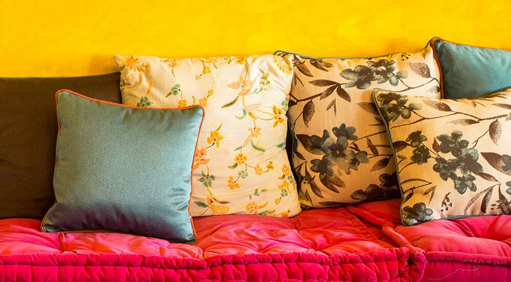
You might want to use your 60% of base color on the biggest parts of your interior design project – walls, floor coverings, large pieces of furniture – with 30% accent colors adorning the chairs, window treatments, etc. and the remaining 10% color pop being added strategically with throw pillows, art, and other accoutrements.
When you get right down to it, defining color spaces becomes a lot easier when you lean on proper color theory, a sound color palette foundation that been built with the help of the color wheel, and splashes of complementary colours that are based off of primary RGB color or RYB color selections.
Start to spread your wings from there into secondary colors and tertiary colors as they pop up along your analogous wheel selections, but above all else really think about what you’re trying to create in a particular space before you jump right in.
The last thing you want to do is base all of your decisions exclusively off of what the color wheel is telling you.
You need to think about the atmosphere, the emotion, utility, the functionality, and the overall impact that the total design is going to be making in a particular space – and whether or not that is harmonious with the colors that you are working with.
This is really where the creativity and imagination of interior designers is so valuable and why you’ll want to learn the concrete rules of color theory and color vision before you go about bending them and even breaking them (strategically) to create something really special and something really personal.