The use of color theory in interior design is critical to create a final result that is not only pleasing to the eyes but will also create the kind of statement you wish to convey.

Color theory refers to the study of colors and the right way of using them in good harmony. This is particularly helpful in interior design as it lets you know the palette that will work and blend well together.
These options play a vital role in your home’s overall appearance and environment since color tends to influence feelings, and moods and sometimes, it can even increase and improve the quantity and quality of your sleep every night. The interior design of your home can also be done by choosing fabrics and furnishings in colors that fit your unique personality and character.
Color Theory and Its History at a Glance
The color theory principles date back way beyond than Leonardo da Vinci himself. After several centuries, the resulting color wheel displays tertiary, secondary, and primary colors.
- Primary colors include blue, yellow, and red.
- Secondary are combinations of primary colors specifically purple, orange, and green.
- Tertiary result from the mixture of one secondary and one primary color.
Select the Right Paint Colors for Your Interior Design
Even though there are separate rooms in a house, every area must flow seamlessly and effortlessly into the other rooms to form a cohesive theme for your interior design. If all rooms have harshly varied decorating styles and color palettes, it can result in an abrupt and unsettling overall effect.
This is why colors, objects, patterns, and fabrics should all create a calming balance that evokes a feeling of being connected and natural.
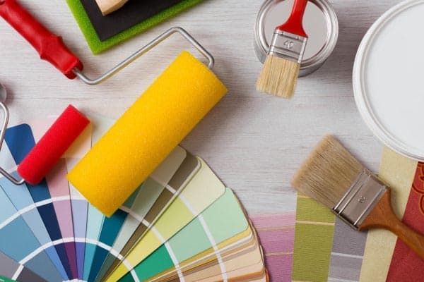
There are homeowners who choose to use the same paint color on every wall of connected space in the house. It is specifically suitable for houses with open floor plans.
Those homeowners who like some variety can use colors on the walls according to the sight lines from room to room. Visual connections between the rooms will create a pleasing color scheme effect.
Create the Perfect Harmony for Your Interior Design
You can use the relationship of the colors on the color wheel with each other to find interesting combinations of pairs. These are what you call harmonies and the most popular types include the following:
Analogous colors
Analogous colors are the small groups of colors neighboring each other on the color wheel.
Monochromatic colors
These are single colors broken down into several values.
Split-complementary
These are trio colors with one sitting opposite two colors neighboring the complement.
Complementary
These are two colors sitting directly opposite each other on the color wheel.
Tetradic or double-complementary
These are two pairs of complementary colors.
Triadic
These are three colors equidistant from each other on the wheel.
Choose a Temperature Palette
Many colors belong to one out of two temperatures or sometimes known as tones although technically, tone pertains to the quantity of gray in a color.
- Cool – green, purple, indigo, and blue
- Warm – yellow, orange, pink, and red
Mixing different temperatures will result in versatile and rich colors like plum or chartreuse.
An easy way to create an attractive theme is by choosing a cool or a warm palette, different colors that are just within the scheme. For instance, if you want to go for cooler tones, you can have your walls painted with soft light blue then use white or gray in painting the trim. A warm palette could use diffused peach walls and eggshell or ivory trim.
The neutral paints could be mixed and matched with cool or warm accents. Neutral colors such as taupe or beige have undertones such as blue, pink, or yellow. It means that the design will be affected if you choose one that has an undertone that contrasts or matches with the rest of the elements.
These undertones can create spatial effects on any space. Warm colors can make a surface feel cozier and closer while cooler tones create an illusion of space.
Characteristics and Meaning of Colors Based on Color Theory
One aspect of color theory in interior design has something to do with the imposed characteristics people usually associate with a particular color. There are people who hypothesize that the relationship between color and personality comes from synesthetic expression. No matter where this association came from, it is important for interior designs to be extra careful in choosing their palettes for the particular impression they want to leave on viewers.
- Yellow – energetic, fun, friendly, joyous, spontaneous
- Orange – charismatic, extroverted, instinctive, optimistic
- Red – bold, active, powerful, ambitious, passionate
- Blue – intelligent, controlled, authoritative, responsible, content
- Green – prosperous, growth, restorative, hopeful, generous
- Purple – fanciful, compassionate, creative, devoted, distinguished
The value or the darkness or lightness of a color can further lift or enhance these characteristics. Black has some traits you can consider if you prefer a darker scheme. On the other hand, you can use white if you want to make the space look brighter.
- White – pure, wise, innocent, influential, honest
- Black – mysterious, elegant, confident, judicious, commanding
Colors can evoke these traits and mix with your senses in such a way that they will leave you feeling as if you are in perfect harmony with them. The scheme and saturation of the interior design of a house can also boost moods and offer some kind of color therapy in every room.
Balance Your Color Palette
You might get carried away easily once you find that one color you love. To ensure that your chosen palette is attractive enough, you need to strike a careful balance. The ration often used here is 60:30:10.
Pick one dominant color that will fill up 60% of space. Neutrals are usually the choice of most interior designers for their dominant color. Choose accent and secondary colors. The secondary color will fill up 30% of the space while accents will occupy around 10%.
With the help of color theory, you can look forward to creating the interior design of your dreams!


